The Yield Curve as a predictor for the SP500
The question is: Does Treasury Yield data contain usable information on trading the SP500?
The answer seems to be yes.
I am using 3 month, 5 year, 10 year and 30 year Treasury yield data from 1977 to September 2011. The data comes from Yahoo.
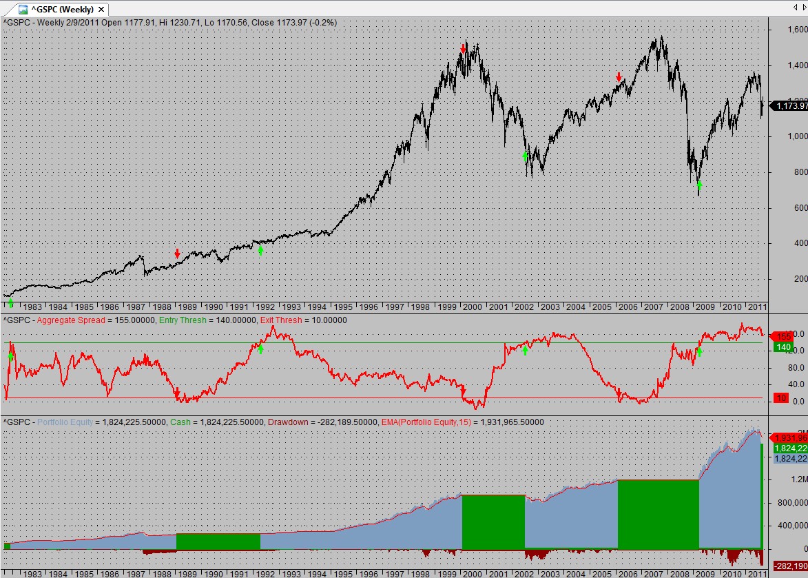
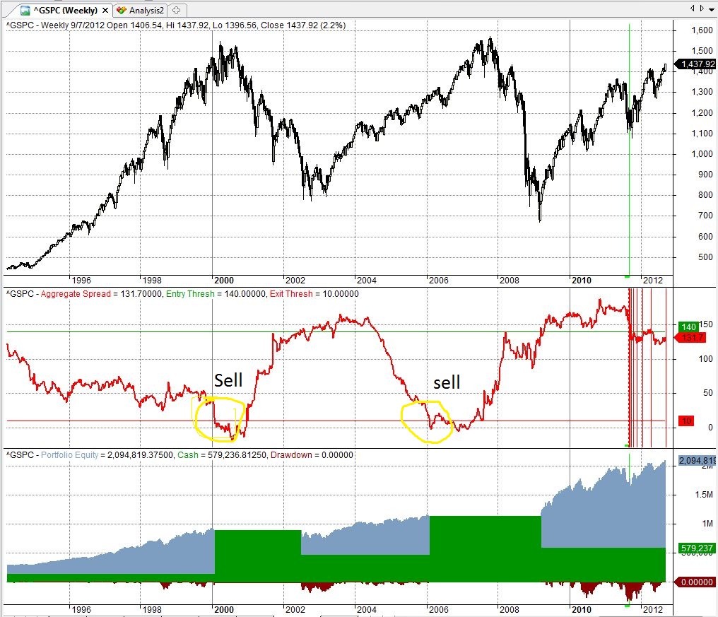
The red line in the middle pane is a weighted aggregate of the yield spreads.
--w1* (30y-10y)+w2*(10y-5y)+w3*(5y-3M).
In other words the more far apart the yields are (the steeper the yield curve), the higher the red line is. The closer together the yields are the lower the red line is.
My preferred method to quickly check if there is some kind of usable relationship is to set up a linear perceptron with the 3 yield spreads as inputs and then optimize the weights of the inputs. The outcome could not have been traded (as it is optimized) but as you see it does say something about the usability of the data. It confirms common sense: It's good to buy on a steep yield curve and sell on flat yield curves. Out of the three "spreads" the 30Y yield minus 10Y yield is the on that matters most (has the most weight in the perceptron).
Conclusion: Yield curve data seems to give one useful macroeconomic signal. The possible end of a multi-year Bull market. For example, at present time (September 2011) and after a panic driven -17% drop in the SP500, this particular model seems to imply that this is a short to medium term correction rather than the start of a multi-year bear market. The red line is currently above 140 and a long way from the sell signal at 10. This is due to immense Fed intervention that keeps yield extremely low.
Update - September 2012 -
Well it was a short to medium term correction and the SP500 advanced some 20%+ since then. Still it seems the red middle line is nowhere near the bottom threshold where this simplistic model would issue a sell signal.